When plotting means and confidence intervals, sometimes the mean lines are hard to see and it’s nice to have included in your legend the color of the confidence interval shading. It turns out this is a bit of a chore in Matplotlib, but building off of their online examples you can get something that looks pretty alright:
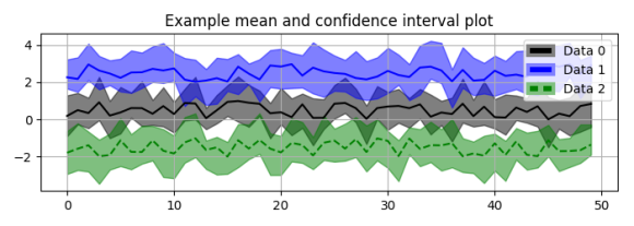
So here’s code for getting the above plot, with an option for solid or dashed lines. The sky is the limit!
import matplotlib.pyplot as plt
import matplotlib.patches as mpatches
from matplotlib.colors import colorConverter as cc
import numpy as np

def plot_mean_and_CI(mean, lb, ub, color_mean=None, color_shading=None):
    # plot the shaded range of the confidence intervals
    plt.fill_between(range(mean.shape[0]), ub, lb,
                     color=color_shading, alpha=.5)
    # plot the mean on top
    plt.plot(mean, color_mean)

# generate 3 sets of random means and confidence intervals to plot
mean0 = np.random.random(50)
ub0 = mean0 + np.random.random(50) + .5
lb0 = mean0 - np.random.random(50) - .5

mean1 = np.random.random(50) + 2
ub1 = mean1 + np.random.random(50) + .5
lb1 = mean1 - np.random.random(50) - .5

mean2 = np.random.random(50) -1
ub2 = mean2 + np.random.random(50) + .5
lb2 = mean2 - np.random.random(50) - .5

# plot the data
fig = plt.figure(1, figsize=(7, 2.5))
plot_mean_and_CI(mean0, ub0, lb0, color_mean='k', color_shading='k')
plot_mean_and_CI(mean1, ub1, lb1, color_mean='b', color_shading='b')
plot_mean_and_CI(mean2, ub2, lb2, color_mean='g--', color_shading='g')

class LegendObject(object):
    def __init__(self, facecolor='red', edgecolor='white', dashed=False):
        self.facecolor = facecolor
        self.edgecolor = edgecolor
        self.dashed = dashed

    def legend_artist(self, legend, orig_handle, fontsize, handlebox):
        x0, y0 = handlebox.xdescent, handlebox.ydescent
        width, height = handlebox.width, handlebox.height
        patch = mpatches.Rectangle(
            # create a rectangle that is filled with color
            [x0, y0], width, height, facecolor=self.facecolor,
            # and whose edges are the faded color
            edgecolor=self.edgecolor, lw=3)
        handlebox.add_artist(patch)

        # if we're creating the legend for a dashed line,
        # manually add the dash in to our rectangle
        if self.dashed:
            patch1 = mpatches.Rectangle(
                [x0 + 2*width/5, y0], width/5, height, facecolor=self.edgecolor,
                transform=handlebox.get_transform())
            handlebox.add_artist(patch1)

        return patch

bg = np.array([1, 1, 1])  # background of the legend is white
colors = ['black', 'blue', 'green']
# with alpha = .5, the faded color is the average of the background and color
colors_faded = [(np.array(cc.to_rgb(color)) + bg) / 2.0 for color in colors]

plt.legend([0, 1, 2], ['Data 0', 'Data 1', 'Data 2'],
           handler_map={
               0: LegendObject(colors[0], colors_faded[0]),
               1: LegendObject(colors[1], colors_faded[1]),
               2: LegendObject(colors[2], colors_faded[2], dashed=True),
            })

plt.title('Example mean and confidence interval plot')
plt.tight_layout()
plt.grid()
plt.show()
Side note, really enjoying the default formatting in Matplotlib 2+.

Great post, thanks